I am collecting reviews and information about the Olympus E-620 here with the idea of replacing my E-510 with it.
ReviewsThe E-620 (Four Thirds Photo)Review includes sample images (all JPEG).
Techradar Olympus E-620 reviewCNET E-620The E-620 is a revolutionary camera. It combines one of the most compact and lightweight DSLR camera bodies with an articulating LCD screen for use with Live View. I cannot imagine a more portable and flexible camera. It is perfect for a vacation or for getting views from unusual angles. Mount the 9-18mm ultra wide angle and you have an incredible camera for reportage, with its wide all encompassing view and deep depth of field.
Olympus cameras are excellent starter cameras. The kit zoom lenses produce better image quality than most kit zoom lenses. You cannot find a better a value than the dual zoom lens kits.
If you are an average person buying a DSLR and not a professional photographer, the E-620 does not fall "behind the competition on most counts." The kit lenses are ahead of the competition, with designed for digital lenses that are not warmed over designs from twenty years ago, which are sharp from edge to edge and wide open. The 14-42mm and 40-150mm are the lightest and most compact lenses I've ever seen for a DSLR camera. I own and use them myself and I can go out walking, with one lens mounted and the other in my coat pocket. The quality of the kit lenses is more than sufficient for any purpose a family or amateur photographer could want, except for low light photography. The resolution of the lenses is higher than most lenses on the market, and 4/3 sensor is more than adequate for printing at 8 x 10 inches or less, which are the sizes the majority of photographs in the world are printed at. Most wedding photographers produce images at 8 x 10 or less. Think about it. I know a wedding photographer who several years ago shot weddings with a Nikon 990, a 3 megapixel camera. 3MP is enough for 5 x 7 or less and good enough for a few carefully processed 8 x 10s. The 4/3 sensor is many times larger than this one and is not much smaller than an APS-C sensor. At 8 x 10 or smaller, the majority of photographs, any noise due to the slightly smaller sensor is not going to show up unless at high ISO sensitivity. Take a look at my Flickr album. Do you see any noise in most of the pictures? Most people will be sharing images online or printing 4 x 6 with an occasional 8 x 10. The 4/3 sensor is more than enough to handle this, much more than enough, with the exception of high ISO photography.
Let me say something about 4/3 lenses. Before you stand in awe of the large lens collections available from other makers, consider that many of those lenses only work on a particular camera, there is something you need to know:
All 4/3 lenses work on all 4/3 cameras.
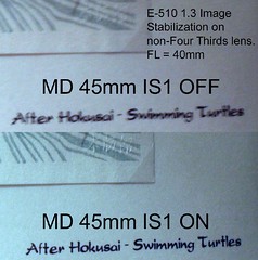
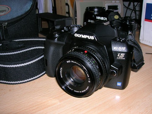
This means the best lenses made for 4/3 cameras can be used with the least expensive cameras. I can put the awesome 150mm f/2 on the E-410 (or in my case, the outstanding Panasonic Leica 14-50mm f/2.8-3.5 on my E-510). In other makers lineups, the best lenses may be unavailable on the lower end cameras because the mounts differ.
But I digress. The review agrees, the E-620 has "fabulous photo quality." The review goes off the tracks on several points.
though it offers competitive photo quality, it lacks the (admittedly primitive) video capture capability that Canon and Nikon have brought down to this price segment
Why is it not competitive to avoid releasing a poorly implemented, low quality video capability into the marketplace? It seems smart to wait. Perhaps the reviewer is unaware of the Micro 4/3 product, which will likely be the camera line Olympus will cover video with.
It has Olympus' trademark grip, shallower than its competitors' grips, which I find less comfortable; definitely a reason for you to hold the camera and give it a feel before you buy.
"Trademark grip?" Olympus cameras have several different grips. The E-510 sytle grip is the best I've ever used, and fits my hand perfectly. The E-410 grip is inspired by grips from the SLR period, and suited to the compact design of the camera body. The E-620 grip tries to be unobtrustive and suited to the compact design. You don't hold a camera by a grip, you hold it by the lens. The grip is to hang onto the camera and steady it. I can't imagine it being less comfortable than the Canon 450D, which is small and cuts into my hand like a knife blade. Admittedly, it is a personal decision.
The super control panel is a dream. It makes most of the menu digging unnecessary. Nearly all photographic controls are directly available with a single click of the OK button and a bit of navigation. They are correct to note the Exposure Bracketing settings are buried in the menu, which can be a pain.
Most professional photographers prefer Compact Flash cards and I prefer them to the fiddly little SD cards. The SD card may be easier for the user stepping up from a digicam, but if you transfer photos from the camera using a USB cable, you can simply leave the card in the camera and never have to worry about bending a pin on the CF card.
It powers on and shoots in 1.4 seconds, which does rank on the slow side for its class.
Once again, we have to put up
with the idiotic "start up time" measurement. The power up time is slow because the world class dust removal system is operating on power up. Are you willing to sacrifice a few tenths of a second for hours and hours of spotting dust flecks or minutes each day of sensor cleaning? I am.
If you think this startup time is slow, I challenge you to take an E-system camera, turn it on and try to bring the viewfinder to your eye before the camera is ready to shoot. I can't do it.
This is a straw man. If you feel the need for instant start up, just put the camera in sleep mode. It will wake up immediately when you press the shutter button.
Some good things pointed out by the review.
The 2x multiplier (compared to 35mm). They note the coverage of the kit zooms is 28-84mm and 80-300mm EFL.
The 12MP does provide extra detail from what I have seen in RAW examples. The TruePic III+ engine improves on the already excellent JPEG engine Olympus cameras are known for. Many photographers choose Olympus because the JPEG output is so good they do not have to post process.
The one weakness of the E-620 is high ISO. It does produce a bit more noise at base ISO, but so do other high megapixel cameras like the A350. At high ISO, other APS-C cameras will do better, but you must ask yourself, will you see the difference in your prints or on the web?
Though it's a solid, serviceable dSLR, if you're looking for an easy-to-learn, entry-level camera, I'd steer clear of the Olympus E-620.
The conclusion seems contradictory. I believe the reviewer meant to say that for people stepping up from digicams they should consider the other makes, but that for serious, advanced photographers, the E-620 does fine. This seems complimentry.
The E-620 has many features that people stepping up from digicams should find beneficial.
* Image stabilization. All 4/3 lenses are image stabilized on the E-620. From other makes, pricey stabilized lenses are required. Image stabilization just works, without any need for the digicam shooter to know or do anything on any 4/3 lens.
* An articulating LCD screen. To take full advantage of Live View, an articulating screen is necessary. I want to warn digicam users: a DSLR is not a digicam, the Live View on ANY DSLR is not going to operate as quickly and easily as your digicam LCD view for shooting. This is due to the mechanics of the reflex and interchangeable lenses. The Live View cameras are improving, the E-620 is one of the best, but you will sacrifice some ease of use for a more capable camera, if you're willing to learn something about photography.
* Dust removal system. What they don't tell you is the time you save on "start up" will be spent in hours cleaning dust spots from your images if you don't have a good dust removal system. The E-620 has the best dust removal system of any DSLR camera. Some people will tell you it is easy to clean your sensor, but if you're stepping up from a digicam, you probably don't want to ever clean your sensor. I haven't cleaned mine in two years.
* Art Filters. I think digicam users will enjoy the art filters. You can see how the effects apply in Live View.
It seems the review cannot decide whether it wants to present technical information for experienced photographers or provide advice for those stepping up from digicams. If the camera is being reviewed for beginners, why bother to include the technical gibberish?
The E-620 takes good pictures. It will take better pictures than a digicam, if you're willing to learn a little about photography. You won't have to worry about cleaning the sensor or spotting dust in your pictures (dust is a part of life with interchangeable lenses). You will get extra detail with 12MP without going too far and getting too much noise, as 12MP digicams do. It comes with excellent kit lenses. You can use any lens in the 4/3 lineup, but most people will be satisified with the kit lenses.
If you expect to take pictures of your kids playing ball in the back yard at twilight you may want to get a Canon, because the E-620's one weakness is high ISO shooting. It's good, but with the slow kit lenses provided by most makers, high ISO is necessary for shooting in near dark or under poor flood lights. This affects any camera, but Canon is the high ISO king. You can always fit a faster lens, like the 14-54 f/2.8, or use the flash.
PreviewsDPReview Olympus E-620 PreviewPreview includes sample images. Full-size downloadable image samples. This is the best of the previews.
Olympus E-620 Digital Camera First Impression Review(Cursory review of pre-production camera. No image samples.)
DCRP First Look: Olympus E-620(Review of pre-production camera. No image samples.)
PMA 2009: Panasonic GH1 & Olympus E620Olympus' E-620 raises the bar for entry-level DSLRsOlympus
Olympus E-620
If you're looking for raw images to compare cameras, try http://raw.fotosite.pl/ where you can download E-1, E-3, E-510, E-30, and I hope, E-620 images for comparison.Labels: camera, fourthirds, photography