Blown Highlights and Blown Highlights
There is a lot of talk about "blown highlights" in digital photography forums, especially with respect to my camera of choice, the Olympus E-510. I think it needs to be clear what we are talking about. There are two kinds of blown highlights. The first is where highlights are blown in the captured image. These are lost forever to the photographer, even if storing the raw file data from the image capture. The second kind is where highlights are blown in the image developed from the captured image.
The first kind comes from incorrect exposure or dynamic range limitations in the sensor, which the photographer cannot do anything about after the exposure is made. The second kind the photographer has more control over (other than getting the exposure right) through the JPEG engine adjustments. Blown highlights in the developed image can be the result of these adjustments, not a limitation of the camera or exposure.
To clear up any confusion in my mind over the effects of camera adjustments I developed images representing the extremes of the 510's development adjustments. The intention was to show the widest range of contrast possible using the in camera adjustments on a difficult subject.
Noise reduction and sharpness also influence highlights in the result, but their effects are minimal compared to contrast and saturation. I left the sharpness at minimum, as if I intended to bring the image into my image editor before applying sufficient sharpening for printing. Noise reduction, by blurring pixels, can affect the measurement of dynamic range, so it was turned off (the E-510 allows noise reduction to be turned off completely).
Muted
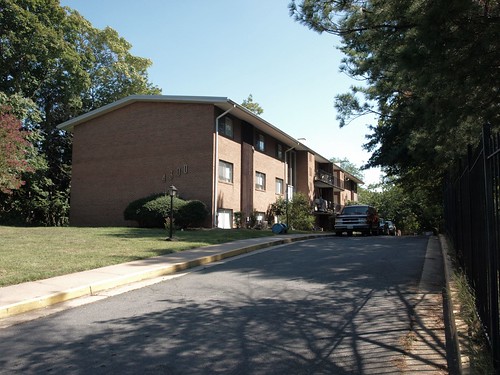
This scene was shot with the E-510 and developed in Master 2.04 using the following settings:
Picture Mode: Muted
Contrast: -2
Saturation: -2
Sharpness: -2
Noise Filter: OFF
(The Master 2 raw developer honors the E-510 camera settings, giving the same results from developing an image at the computer as in the camera).
Vivid
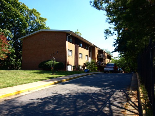
This scene was shot with the E-510 and developed in Master 2.04 using the following camera settings:
Picture Mode: Vivid
Contrast: +2
Saturation: +2
Sharpness: -2
Noise Filter: OFF
The difference is best seen by examining the venetian blinds in the window on the corner of the first floor nearest to the viewer. Although it is difficult to see in the photographs resized for the web, the window shows nicely how the contrast and saturation (including Picture Mode) adjustments influence the highlights of the developed image, so I have provided a detail:
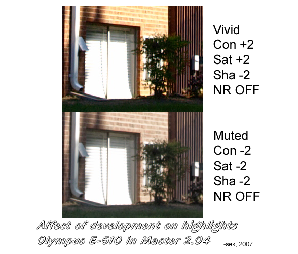
In the Vivid image, the highlights on the blinds appear completely blown. In the Muted image more of the venetian blinds are visible. The lower contrast rendering shows more detail than the higher contrast one. What appears as a "blown highlight" shows detail as the contrast and saturation are reduced, proving the detail was there in the original capture. This is not an example of highlight recovery, it shows how the raw image contains detail that gets obliterated by the contrast curve.
(If you would like to read more about how contrast curves influence perception and testing of "dynamic range" read How to Magically Improve You Camera's Dynamic Range).
True Blown Highlights
In fact, this photograph does contain highlights blown at capture, the yellow sidewalk curb is blown along the front length and the far sky toward the horizon is blown a bit (when recovery of highlights is attempted, this part of the sky posterizes). The detail in these areas is completely lost, even in the captured image.
What does not count as a blown highlight is a specular reflection or element in the scene that is naturally so bright it does not contain any detail. Such reflections should be rendered in the captured image and final print as completely white without any texture. The reflection from a wave top, chrome on an automobile, and the like. In the example picture, the yellow curb is painted with a material designed to reflect light to give it greater visibility, which is partly why it exhibits blown highlights.
Local Contrast Enhancement
There is a way to increase the perceived contrast of an image without blowing the details in highlights. One is called "local contrast enhancement" and is a technique for increasing what is called "micro contrast." Micro contrast is the amount of contrast at the edges of objects. Increasing micro contrast makes an image appear sharper, clearer and increases perceived acuity, which is why photographers seek lenses with better "contrast" by which they mean the ability to provide greater contrast between edges and in details. It is the contrast of fine detail, not the overall contrast of the scene.
Basic LCE is simple. Just set apply unsharp mask with a very wide radius and a small amount. You will see the "fog" lift immediately from your picture. Local contrast can be pushed beyond small amounts without blowing highlights by using a "gray mask" (This is a mask inverted to protect highlights from changes) in LAB space.
Using LightZone, one can protect highlights from changes by adding a sharpen tool to the stack and then selecting only the highlights from the tonal range, and inverting the the mask, which automatically creates a mask excluding effects of sharpening from highlights. Another LightZone trick is softening blown highlights to make the less distracting and more acceptable to the eye, by adding a blur tool to the stack and selecting only the highlight tones, so the blurring only applies to the lightest highlights. Some adjustment of the selection range is necessary to smoothly integrate the blurring at the edges and soften highlights into gray tones. This is very similar to the technique of blurring the image slightly in "glamor shots" to give the image an ethereal look.
Thanks to dpreview.com forum members (Nik121 and gollywop) for their comments.
My attempt at defining some unfamiliar terms.
Blown Highlight. A highlight without detail or tonality, which equals or exceeds the white level of the capture. People find highlights with detail or gradient more attractive and less distracting. A "hot" highlight is one that appears blown or is distracting, but not actually blown.
Specular Reflection. A point source of light or bright reflection, such as the crest of a wave, which does not contain any detail. These highlights will always be "blown" as they should be, represented by white in the image. A point source may not be a reflection, but for all practical purposes it falls under this category in photography.
Highlight Recovery. This is where extra information the camera captured in the exposure is used to reconstruct highlights. Ordinarily, this can only be taken so far, and anywhere detail was not captured in the original raw image, the highlight will be replaced by gray.
Captured Image. This is the raw image data, which cannot be viewed as an image without development.
Developing. The raw image data is converted into a viewable form through development, which either happens at the computer or in the camera through a JPEG engine.
JPEG Engine. The hardware and software the camera uses to develop the captured image in the form of raw data into a usable image in the JPEG format.
The first kind comes from incorrect exposure or dynamic range limitations in the sensor, which the photographer cannot do anything about after the exposure is made. The second kind the photographer has more control over (other than getting the exposure right) through the JPEG engine adjustments. Blown highlights in the developed image can be the result of these adjustments, not a limitation of the camera or exposure.
To clear up any confusion in my mind over the effects of camera adjustments I developed images representing the extremes of the 510's development adjustments. The intention was to show the widest range of contrast possible using the in camera adjustments on a difficult subject.
Noise reduction and sharpness also influence highlights in the result, but their effects are minimal compared to contrast and saturation. I left the sharpness at minimum, as if I intended to bring the image into my image editor before applying sufficient sharpening for printing. Noise reduction, by blurring pixels, can affect the measurement of dynamic range, so it was turned off (the E-510 allows noise reduction to be turned off completely).
Muted
This scene was shot with the E-510 and developed in Master 2.04 using the following settings:
Picture Mode: Muted
Contrast: -2
Saturation: -2
Sharpness: -2
Noise Filter: OFF
(The Master 2 raw developer honors the E-510 camera settings, giving the same results from developing an image at the computer as in the camera).
Vivid
This scene was shot with the E-510 and developed in Master 2.04 using the following camera settings:
Picture Mode: Vivid
Contrast: +2
Saturation: +2
Sharpness: -2
Noise Filter: OFF
The difference is best seen by examining the venetian blinds in the window on the corner of the first floor nearest to the viewer. Although it is difficult to see in the photographs resized for the web, the window shows nicely how the contrast and saturation (including Picture Mode) adjustments influence the highlights of the developed image, so I have provided a detail:
In the Vivid image, the highlights on the blinds appear completely blown. In the Muted image more of the venetian blinds are visible. The lower contrast rendering shows more detail than the higher contrast one. What appears as a "blown highlight" shows detail as the contrast and saturation are reduced, proving the detail was there in the original capture. This is not an example of highlight recovery, it shows how the raw image contains detail that gets obliterated by the contrast curve.
(If you would like to read more about how contrast curves influence perception and testing of "dynamic range" read How to Magically Improve You Camera's Dynamic Range).
True Blown Highlights
In fact, this photograph does contain highlights blown at capture, the yellow sidewalk curb is blown along the front length and the far sky toward the horizon is blown a bit (when recovery of highlights is attempted, this part of the sky posterizes). The detail in these areas is completely lost, even in the captured image.
What does not count as a blown highlight is a specular reflection or element in the scene that is naturally so bright it does not contain any detail. Such reflections should be rendered in the captured image and final print as completely white without any texture. The reflection from a wave top, chrome on an automobile, and the like. In the example picture, the yellow curb is painted with a material designed to reflect light to give it greater visibility, which is partly why it exhibits blown highlights.
Local Contrast Enhancement
There is a way to increase the perceived contrast of an image without blowing the details in highlights. One is called "local contrast enhancement" and is a technique for increasing what is called "micro contrast." Micro contrast is the amount of contrast at the edges of objects. Increasing micro contrast makes an image appear sharper, clearer and increases perceived acuity, which is why photographers seek lenses with better "contrast" by which they mean the ability to provide greater contrast between edges and in details. It is the contrast of fine detail, not the overall contrast of the scene.
Basic LCE is simple. Just set apply unsharp mask with a very wide radius and a small amount. You will see the "fog" lift immediately from your picture. Local contrast can be pushed beyond small amounts without blowing highlights by using a "gray mask" (This is a mask inverted to protect highlights from changes) in LAB space.
Using LightZone, one can protect highlights from changes by adding a sharpen tool to the stack and then selecting only the highlights from the tonal range, and inverting the the mask, which automatically creates a mask excluding effects of sharpening from highlights. Another LightZone trick is softening blown highlights to make the less distracting and more acceptable to the eye, by adding a blur tool to the stack and selecting only the highlight tones, so the blurring only applies to the lightest highlights. Some adjustment of the selection range is necessary to smoothly integrate the blurring at the edges and soften highlights into gray tones. This is very similar to the technique of blurring the image slightly in "glamor shots" to give the image an ethereal look.
Thanks to dpreview.com forum members (Nik121 and gollywop) for their comments.
My attempt at defining some unfamiliar terms.
Blown Highlight. A highlight without detail or tonality, which equals or exceeds the white level of the capture. People find highlights with detail or gradient more attractive and less distracting. A "hot" highlight is one that appears blown or is distracting, but not actually blown.
Specular Reflection. A point source of light or bright reflection, such as the crest of a wave, which does not contain any detail. These highlights will always be "blown" as they should be, represented by white in the image. A point source may not be a reflection, but for all practical purposes it falls under this category in photography.
Highlight Recovery. This is where extra information the camera captured in the exposure is used to reconstruct highlights. Ordinarily, this can only be taken so far, and anywhere detail was not captured in the original raw image, the highlight will be replaced by gray.
Captured Image. This is the raw image data, which cannot be viewed as an image without development.
Developing. The raw image data is converted into a viewable form through development, which either happens at the computer or in the camera through a JPEG engine.
JPEG Engine. The hardware and software the camera uses to develop the captured image in the form of raw data into a usable image in the JPEG format.
Labels: digital, photography
posted by Steve Knoblock at
8:42 PM
0 Comments
![]()