HDR Chrome Effect in LightZone

An popular effect is the HDR, gritty, "chrome" look. After watching a video on the technique, I thought I'd give it a try in LightZone.

P6010916_lzn

This look is achieved without actual HDR, but by contrast, local contrast and saturation adjustments.

The steps in LightZone involve dropping a number of tools on the stack and adjusting them, which is a different approach than Photoshop or Lightroom.

  1. Drop a Hue/Saturation tool. Set Vibrance to 100.
  2. Drop a Sharpen tool. Set Amount to 500 and Radius to 50, adjust until you get a "comic book" or "chrome" look (strong blacks, faded, three-dimensional pastel colors).
  3. Drop a Zone Mapper tool. Define points at 2 steps down from white, 5 steps down from white and 4 or 5 steps up from black. Push the white point up to where it divides the top step in two, leave the middle point alone, pull the black point all the way done to keep contrast. Later, you can adjust the middle tone contrast by adjusting the middle point.
  4. Drop another Hue/Saturation tool. Pull the Saturation slider back, reducing saturation until you like the effect.
  5. You may choose to drop a Relight tool to adjust overall brightness and graininess, but you may want to zero the Detail slider or turn off the Sharpen tool and use the Detail adjustment instead.
So you do not have to go through all of these steps, I created the HDChrome style you can download for LightZone here to use as a starting point. Download the archive file, extract the .lzt file and save it to your LightZone templates folder and it will appear under Custom styles.

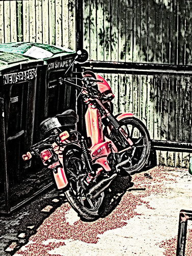
Reducing saturation gives an image the feeling of a drawing, as if an ink drawing has (or photograph) has been tinted. Starting with a pastel image, mostly gray with touches of color gives this result, if there is texture, this will become the "ink" part. If you start with a metal object, like a car or motorcycle, it can enhance the curves and create the appearance the metal has been chromed, and enhance already chromed parts.

Labels: , ,

Resizing the LightZone Preview Window

It can be frustrating for new LightZone users to figure out how to optimize the preview window when editing photographs. On each side of the preview window are panes for displaying navigation and the tool stack, which by default, does not leave much room for previewing the image. Most users want the image to fill the screen as much as possible while editing. After all, isn't that why we paid good money for those huge monitors?

On the left border of the Tools pane is a "grip" denoted by a dot pattern. Grab this with the mouse and drag it to resize the editing window. Generally, you will not be able to create much room this way, because the panel stops at the tool stack. You can only take space from the preview area.

To get the most out of your screen, the best approach is to close one or more of the panes. To close the Tools pane, click on the Tools tab. To restore click the tab again. Do the same with the Styles tab and the whole window is devoted to the preview window. The image will extend to the edges of a narrow border defined by the tabs.

Use the navigation window to scroll around the picture. I prefer this to scroll bars (now that I am used to it).

Labels: ,

LightZone "Smooth Contrast" Experiment

I've been experimenting with LightZone to duplicate the effect available through a Photoshop action, which I am told employs layers of sharpening and Gaussian blur to achieve a heightened but smooth contrast. The effect is really attractive, beautiful and heightens the sense of form in a color photograph, to give it some of the essence of a black and white photograph. I have a strong affinity for this look.

This is my first try, with two pairs of sharpen and blur effects, one for shadow and one for highlight, stacked this way: SH Zone Shadow, GB Zone Shadow and SH Zone Highlight, GB Zone Highlight. The result is a good first approximation to the effect I'm looking for.


The sharpening is set to enhance local contrast and the blur layer above it smooths out any graininess and blends the tones together.

The action I am trying to duplicate is Midnight Black available from Action Central. I have not downloaded or examined this action to reverse engineer it, because I wanted to see if I could unlock its secrets without anything but the results. I doubt I could apply much I could learn from the action to LightZone, other than the tools and stacks in LightZone provide much of the masking and selectivity that PhotoShop does in a much more intuitive way. I believe it has all I need to eventually duplicate this look. I do not have PhotoShop only Elements.

I hate to lengthen this post by waxing philosophically, but use of this action raises the question of how much of the resulting image is the photographer and how much is "Photoshop?" Putting aside the issue of legitimacy of manipulating an image to this degree so easily using a predefined action, I will take a stab at an answer. I give Photoshop credit for half the creative energy in such an image. "What percentage of what makes the image compelling is from Photoshop?" is the question I am forced to ask myself. About half is a conclusion I cannot escape. The other half is the traditional elements of camera and photographer approaching the subject. Without the effect, the image would lose much of its effect.

When I say "image" I mean the original image that inspired me to explore the effect, not necessarily the one in this post, although the same principle applies. You can see the original where this all started on Bootstrap's site (http://www.bootstrapimages.com/Web1107/PB085980-02a%20copyR.jpg), but I won't link to it individually, or guarantee it will be there when you look. Bill Turner also has a blog on Blogger, Eschew Obfuscation.

Labels: , ,